Concept by Stronger Systems

Landing page review · 13 November 2026

Chinnor Gym's landing page, and a suggested new one

Chinnor Gym's Facebook and Instagram ads (the November "30 Day Beginner Strength Programme" ad, March's "30 Day Kickstart" and the summer "6 Week Stronger This Summer" ads) all send people to chinnorgym.co.uk/landing-page. Below, that page sits next to a concept built the way our best-converting gym landing pages are built, using Chinnor Gym's own photos, films, reviews and offer. Phone first, because that's where ad clicks land.

The first screen on a phone

iPhone 13 / 14 size (390 x 844), before any scrolling. Tap a picture to see it full size.

Nowchinnorgym.co.uk/landing-page
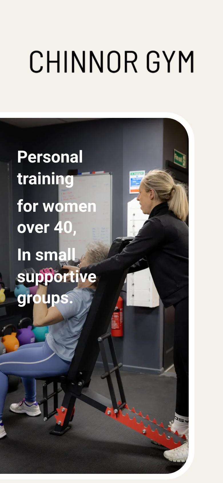
The current landing page's first screen on a phone: logo, photo and headline, no button
Suggestedthe concept
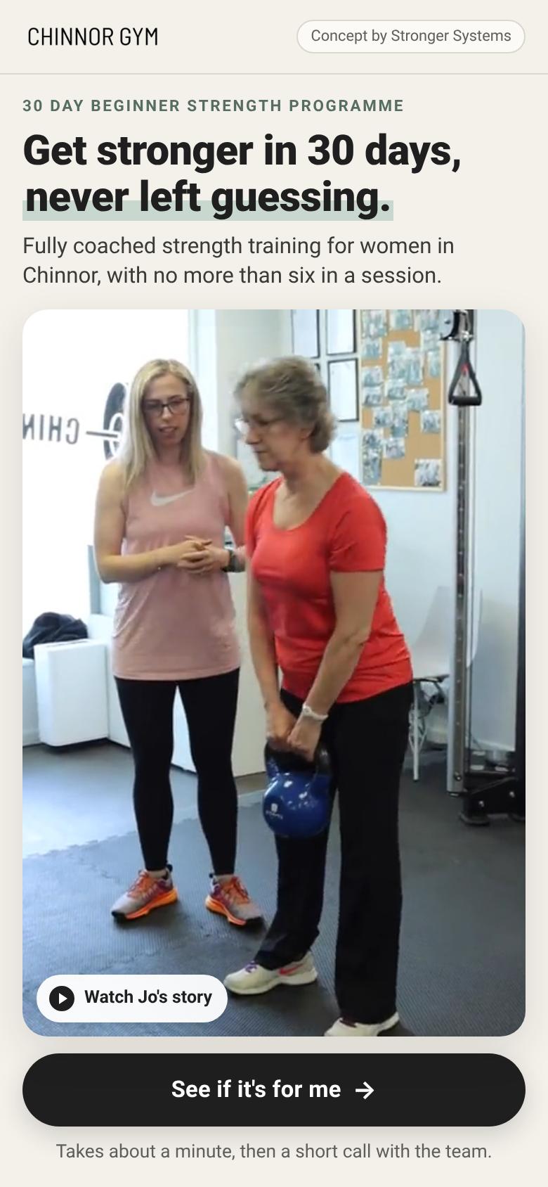
The concept's first screen on a phone: headline, one sentence, a member film, one button

A smaller phone

iPhone SE size (375 x 667).

Now
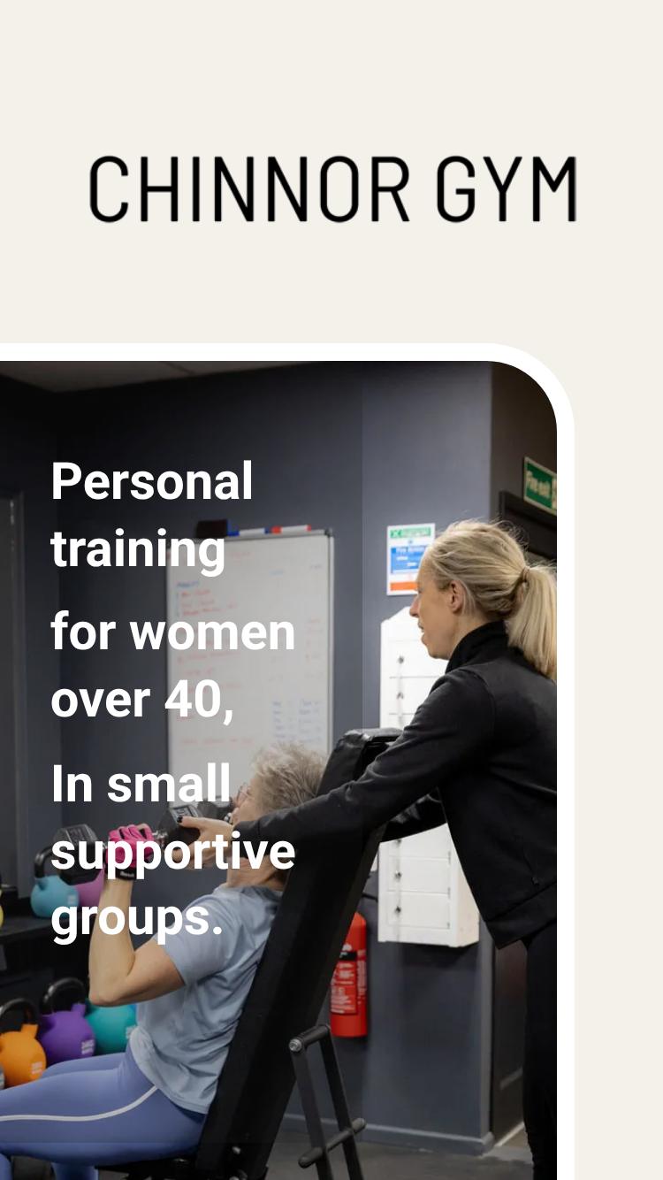
The current page on a small phone
Suggested
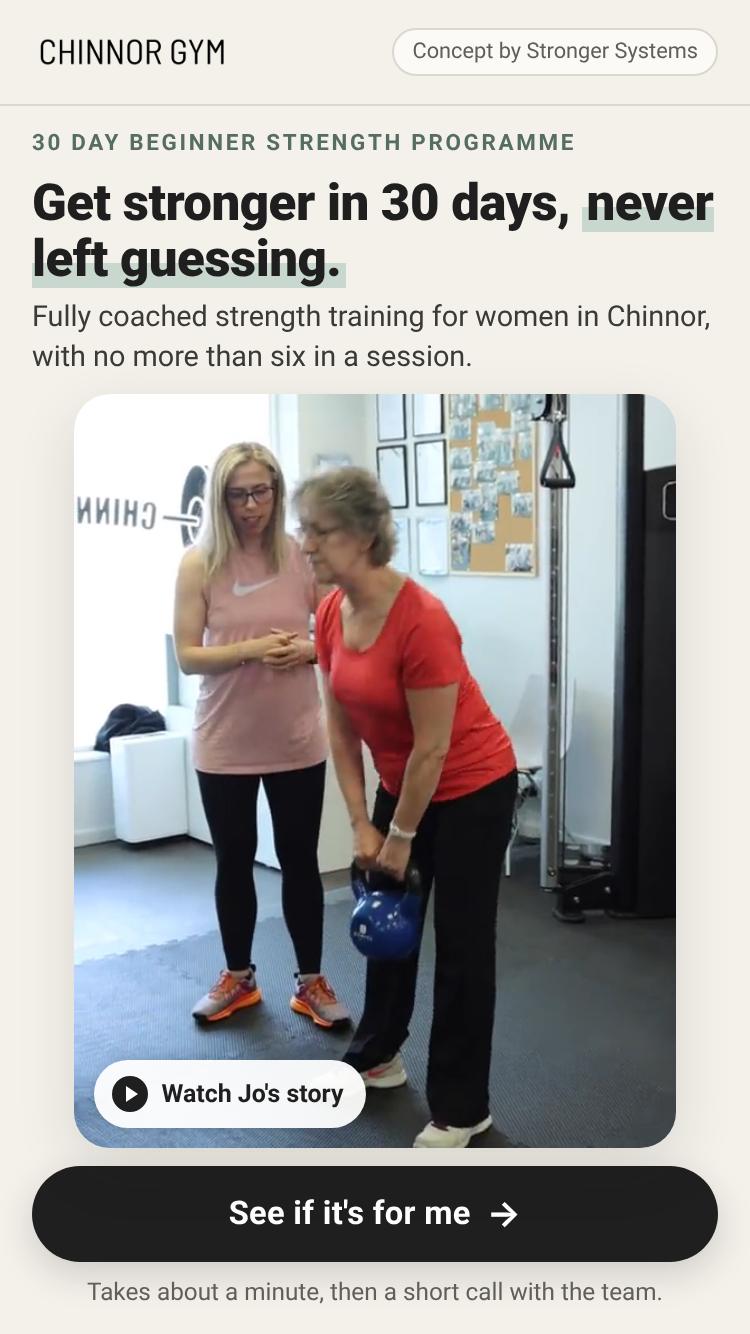
The concept on a small phone

The whole page on a phone

Scroll inside each frame.

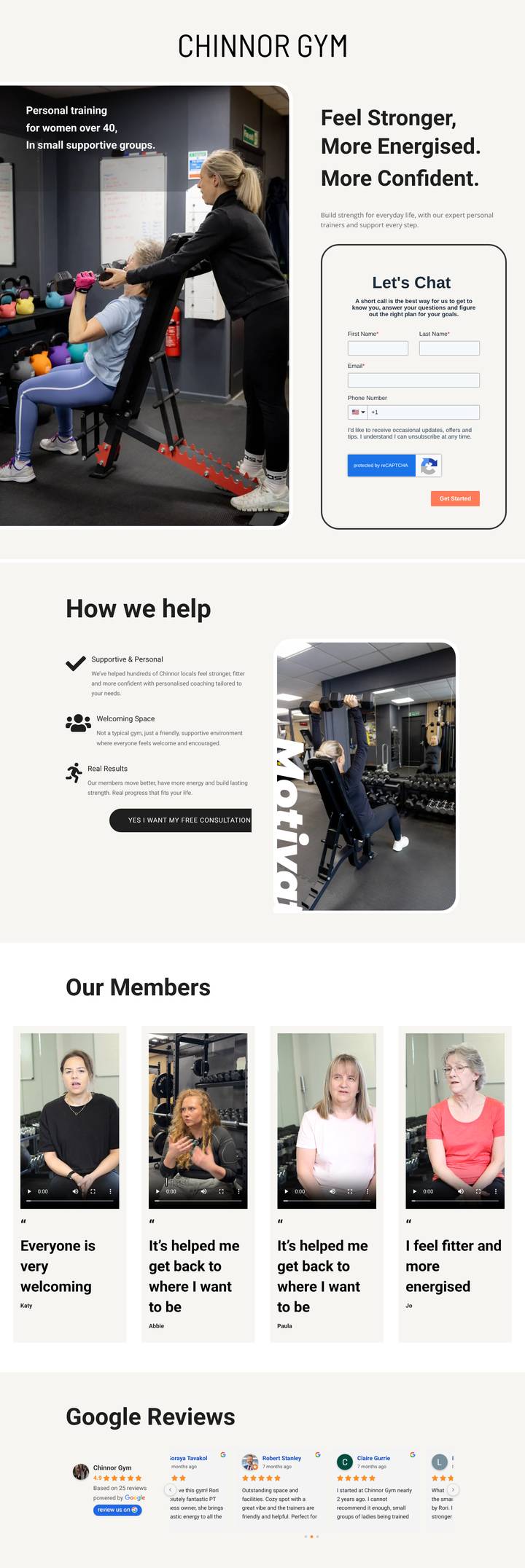
Now
The whole current page on a phone
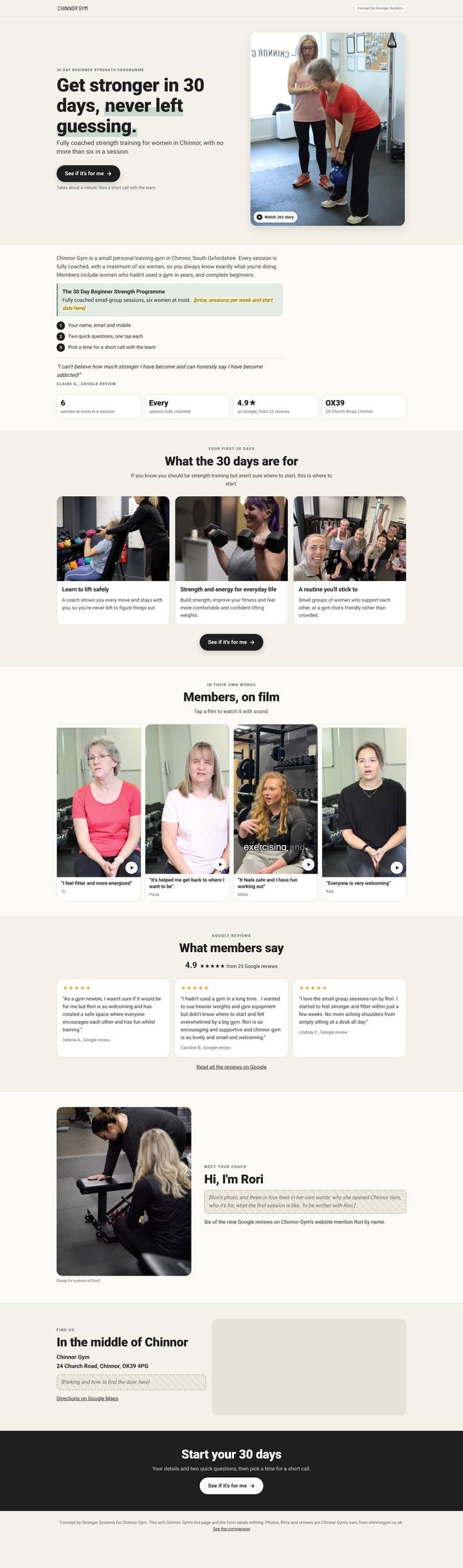
Suggested
The whole concept page on a phone

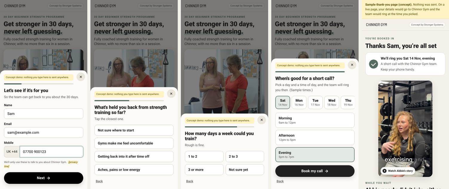
The flow and the thank-you page (suggested)

Details, two one-tap questions, a call time, then a thank-you page that matches a member's film to the answer. In the concept nothing is sent.

The four steps of the concept's lightbox and its thank-you page

On a laptop

1440 x 900, first screen.

Now
The current page on a laptop
Suggested
The concept on a laptop

At a glance

NowSuggested
The ad's offerNot named. The ads promise a "30 Day Beginner Strength Programme", a "30 Day Kickstart" or "6 Week Stronger This Summer"; the page names none of them.The ad's programme is the first line, and the offer sits directly under the first screen.
PriceNot shown.Shown with the offer (a marked placeholder: we couldn't find a published price).
Button on the first phone screenNone. The form starts about 1,200px down; the only button is about 3,000px down.One button, plus a sticky button once it scrolls away.
First screen pictureA good coaching photo, with the headline laid over it.A member's film (Jo with her coach), muted, with a poster frame; tap to watch with sound.
FormHubSpot, one step: first name, last name, email, phone (optional, US +1 by default), reCAPTCHA.A lightbox: name, email, mobile (UK) > two one-tap questions > a day and time for the call.
After the form"Please book your initial assessment with us here", with no link on "here".A thank-you page: the call time, a member's film matched to their answer, what happens on the call.
Meta pixelPageView only; no Lead event in the page.Live version: Lead fires once, when the details are sent. (The concept has no pixel.)
Member filmsFour films, no poster frames, WebM only, 16 to 27 MB each.The same four films, each with a poster frame from the film, MP4, about 4 MB each.
LocationNot on the page.Address and a map.
Search enginesOpen to search, titled "Landing page | Chinnor Gym".noindex (ad pages stay out of search; the main site is what people search for).
Loading (our test)About 1.9 MB and 70 requests on load, mostly third-party scripts; largest picture in about 1.8s.About 1.3 MB and 20 requests on load (0.75 MB of it is the hero film); largest picture in about 0.4s. The map adds Google's scripts when you scroll to it.

What's good on the current page

  • It speaks to a clear audience straight away. "Personal training for women over 40, in small supportive groups" is the first thing on screen. That's the right message for the ads.
  • Real photos from the gym, with a coach next to a member. No stock photos.
  • Four member films. Katy, Abbie, Paula and Jo on camera, in the gym. This is the strongest material on the page, and most gyms don't have it.
  • Real Google reviews, 4.9 from 25, and they're specific: small groups, beginners, Rori by name.
  • A short form that says what happens next ("A short call is the best way for us to get to know you").
  • On a laptop the form sits beside the headline on the first screen.
  • A warm, calm tone and consistent colours; nothing pushy.
  • It loads reasonably quickly. About 1.9 MB on load in our test, with the largest picture showing in under two seconds (on a fast connection).
  • The thanks-and-next-steps page already exists, with a booking calendar, reviews and a clear "what happens on a call" list. It just isn't connected to this form.

What needs work

The ad's offer isn't on the page

What we found
The November ad says "30 Day Beginner Strength Programme", "fully coached" and "a maximum of just 6 women". The page doesn't mention the programme, the price, a start date or the group size. The March and summer ads (a 30 Day Kickstart, a 6 Week programme "limited to just 10 women") went to the same page.
Why it matters
Someone who tapped "Learn more" on a 30-day programme lands on a general page and has to trust it's the same thing, with no idea what it costs.
What our best pages do
One page per ad. The first line and the headline carry on from that ad's hook, and the offer and its price are shown plainly, right under the first screen.

Nothing to tap on the first phone screen

What we found
On a phone the first screen is the logo, a photo and the headline. The form starts about 1,200px down (below the first screen) and the only button is about 3,000px down.
Why it matters
People arriving from an ad decide quickly. If the next step isn't visible, many scroll a little and leave.
What our best pages do
The first phone screen holds four things: a headline about the reader, one sentence, a member's film with a poster frame, and one button, with one short line under it.

The main button reloads the page

What we found
"YES I WANT MY FREE CONSULTATION" has an empty link. Tapping it reloads the page and drops the reader back at the top (we tested it). The button also runs off the right edge on a phone.
Why it matters
The people who tap it are the ones who've decided. They're sent away from the form instead of to it.
What our best pages do
Every button opens the same short flow in a lightbox, wherever you are on the page.

The form ends in a dead end

What we found
After sending, the form shows "Thank you for getting in touch. Please book your initial assessment with us here", and "here" isn't a link (this is in the form's published settings). The thanks-and-next-steps page, with the booking calendar, isn't linked from it.
Why it matters
The moment someone is keenest, there's nowhere to go. The team then has to chase them by phone or email.
What our best pages do
The call time is chosen inside the flow, then a thank-you page confirms it and shows a member's story that matches what they told us.

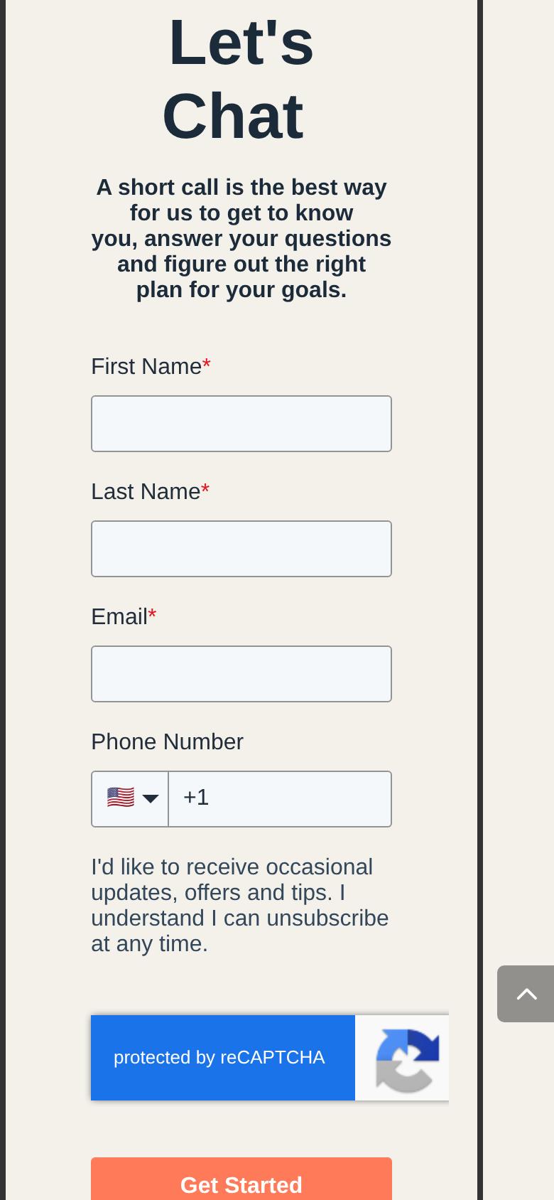
The phone number is optional, and set to the US

What we found
Phone isn't required, and the field opens with the US flag and +1.
Why it matters
The next step is a call, so a missing number means chasing by email. A UK number typed after +1 may be saved wrongly (we didn't submit the form to check).
What our best pages do
Name, email and mobile, all required, with the UK as the default.
The current form, with the phone field set to the US +1

Meta can't see who enquired

What we found
The Meta pixel fires PageView only. There's no Lead event in the page, and no thank-you page to fire one on. (Google Analytics and HubSpot tracking are on the page.)
Why it matters
Without a Lead event, Meta can only optimise for visits, and Ads Manager can't show cost per enquiry for each ad.
What our best pages do
The Lead event fires once, when the details are sent, and each ad carries UTM tags so every lead reports back to the ad it came from.

The member films are heavy and have no cover

What we found
The four films have no poster frame, are WebM only (marked as MP4 in the page) and weigh 16 to 27 MB each, 83 MB together. Until a phone loads the first frame they show as blank grey boxes (we saw this in our own captures).
Why it matters
The best thing on the page can look empty, and is slow to start on mobile data.
What our best pages do
A poster frame cut from each film, at the player's shape, and MP4 files of a few MB. The concept's copies of the same films are about 4 MB each.

Small things

What we found
Abbie's caption repeats Paula's ("It's helped me get back to where I want to be"); on the home page Abbie's is "It feels safe and I have fun working out". There's no address or map. The page is open to search engines with the title "Landing page | Chinnor Gym". The word "Motivate" is cut off at the right edge on a phone.
What our best pages do
The address and a map near the end (it answers "is this near me?"), ad pages kept out of search, and every page checked on two phone sizes before it goes live.

What the new design changes and why

The first screen does one job

The ad's programme name, a headline about the reader ("Get stronger in 30 days, never left guessing"), one sentence (fully coached, women, six at most), Jo's film and one button. It fits at 390 x 844 and 375 x 667.

The offer straight after

The programme, what it includes and the price, then "what happens next" in three steps and a Google review.

A short flow instead of a long form

Name, email and mobile; two one-tap questions (what's held you back, how often you could train); then a day and time for the call. No reCAPTCHA box on screen.

A thank-you page that keeps going

It confirms the call time and plays the member film that matches their answer (for "gyms make me feel uncomfortable", Abbie's), then Chinnor Gym's own "what happens on the call" steps.

Their films, made light

Same films, poster frames from each film, MP4 at about 4 MB instead of 16 to 27 MB.

Proof in their own words

Three Google reviews quoted word for word, the 4.9 rating, the four films, a section for Rori (to be written with her), the address and a map.

One page per ad

This page follows the November "30 Day Beginner" ad. The Kickstart ad (built around Abbie) would get its own page with Abbie's film and hook.

No popups, one button

Nothing opens over the page by itself. A sticky button appears only after the first button has scrolled away.

Tracking, for a live version

The pixel's Lead event fires once when the details are sent, and the form reaches the CRM through one tracking script with the ad's UTM tags. The concept itself has no pixel or form script.

Quick wins if you keep your page

In order: the first three take minutes.

  1. Send people to the booking page after the form. Redirect the HubSpot form to /thanks-and-next-steps/, or link "here" in its message. (The Calendly link there carries "month=2026-01"; worth removing.)
  2. Fix the "YES I WANT MY FREE CONSULTATION" button so it jumps to the form instead of reloading the page.
  3. Add a button on the first phone screen, under the headline, that goes to the form.
  4. Make the phone number required and UK by default.
  5. Name the ad's programme and its price on the page, in the headline or just under it.
  6. Fire a Meta Lead event once when the form is sent (on the thank-you page), so ads can be judged on enquiries, not clicks.
  7. Give the four films poster frames and MP4 copies, and fix Abbie's caption.
  8. Add the address and a map, and set the page to noindex.

How we checked, and what we couldn't

  • Checked on 13 November 2026 in Chromium (Playwright) at 390 x 844, 375 x 667 and 1440 x 900, recording every network request. The ads and where they link come from the Meta Ad Library.
  • We didn't submit the current form, so as not to send Chinnor Gym a fake enquiry. What happens after sending is from the form's published settings.
  • We couldn't check whether HubSpot sends enquiries to Meta from its own servers; nothing in the page does.
  • We didn't test on a real iPhone, so how the WebM films play there is not confirmed.
  • Load times are from a fast connection and will be slower on mobile data, for both pages.
  • We have no conversion data for the current page. "What our best pages do" describes our best-converting gym landing pages this month; it isn't a controlled test of any single change, and we don't promise a particular result.
  • Everything on the concept is Chinnor Gym's own: photos, films and the film captions from chinnorgym.co.uk, reviews from Google, the offer and the "six women" from their ads. Anything we didn't have is marked in [brackets].